.png)
Callpad speaks like a trusted colleague — confident, warm, and real. We celebrate the small wins, focus on tangible outcomes, and always sound human. Every piece of content should feel like it was written by a person who cares, not a brand machine.
"Voice assistant" · "Picks up when your team can't" · "Part of your team" · "Catches what they can't" · "More bookings, less admin" · "Helps you do more"
"AI receptionist" · "Replaces your staff" · Robot / robotic / automated · "You'll never need staff again" · Jargon: NLP, LLM, machine learning · Anything cold or corporate
Open and warm — approachable, human, never stiff or corporate. Celebrates small wins — acknowledge the everyday moments that matter to business owners. Real-world outcomes — focus on results, not features. Makes life easier — less friction, more flow. Technology empowers people — help people do more, not replace them. Results-led — use real Callpad data over generic stats. Human first — every piece of content should feel like it was written by a person who cares.
Our palette is intentionally restrained. White, light gray, and black form the foundation. Colour comes from the clay icons, not from backgrounds, borders, or text highlights. Backgrounds are always white or light gray. Never use dark backgrounds for primary content areas.
Backgrounds are always white (#FFFFFF) or light gray (#F5F5F5). Never use dark backgrounds for primary content areas except for contrast slides in social media. Text is always black (#111) on light backgrounds. Secondary text uses mid gray (#666). Colour comes from the clay icons, not from backgrounds, borders, or text highlights. Keep it low-key. The clay icons are what pops.
Switzer is our sole typeface. Clean, geometric, and modern. It matches our Airbnb-inspired aesthetic without feeling generic. Available weights: Light (300), Regular (400), Semi Bold (600), Bold (700), Extra Bold (800).
Headlines: Bold (700) weight. Body text: Regular (400) weight. Max 2 weights per composition. Left-align or centre-align, never justify. ALL CAPS acceptable for short headlines (3-4 words only), never for body text. Always high contrast: dark text on light backgrounds, or light on dark with overlay.
Headlines: 60-80px, bold/extra bold, max 6-8 words. Subheadline: 36-48px, regular, one sentence max. Body text: 28-36px, regular, max 2-3 lines per slide. CTA: 36-48px, semi-bold or bold. Fine print/URLs: 20-24px. Minimum: Never below 24px for any text. Text covers max 30% of image area.
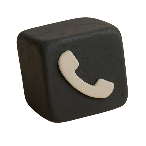
The Callpad logo is a 3D clay-style cube with a teal phone icon. The wordmark is set in Switzer, 700 weight. Always written as "Callpad" with a capital C, lowercase everything else. Never "CallPad", "CALLPAD", or "callpad".
Use on white or dark backgrounds. Maintain clear space around the logo. Use the "Callpad" wordmark alongside when context needs it. Keep the drop shadow for depth.
Stretch, rotate, or distort the logo. Place on busy or clashing backgrounds. Alter the colours of the cube or icon. Use below 32px in digital contexts.
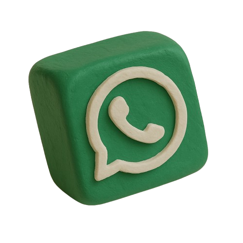
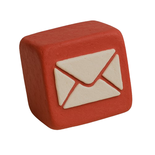
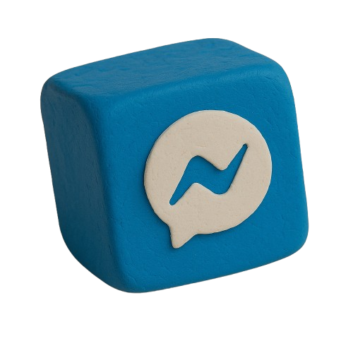
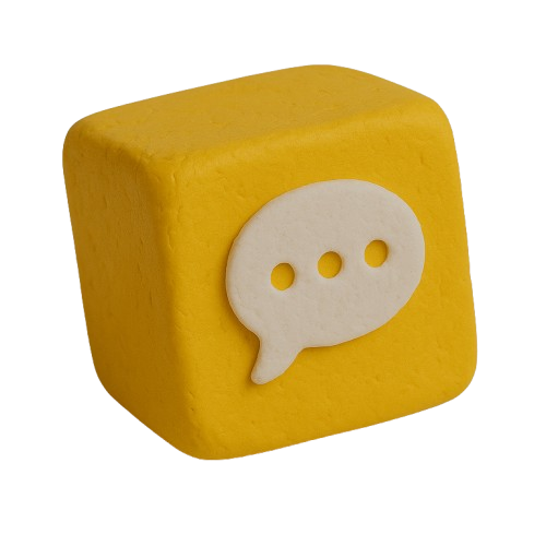
One icon per design, used as a hero accent, typically top-right corner. Always include the drop shadow for depth and consistency. Icons should be 80-140px on a 1080px canvas. The clay texture is what gives Callpad its visual personality. These are not decoration, they are brand identity. Never cluster multiple icons together.
When talking about Callpad to your customers, lead with results. Keep it practical and let the numbers do the talking. Here are sample introductions you can use or adapt.
"A single location generated over £3,200 in bookings in just two weeks, entirely from calls that would have gone to voicemail. Callpad paid for itself within the first week."
"When your team's busy with clients and the phone rings, Callpad picks up. It checks your diary, books the appointment, and handles FAQs, so you never lose a client to a missed call."
"It's not replacing anyone on your team. It's catching the overflow: the after-hours calls, the busy Saturdays, the lunch breaks. Within the first fortnight, over 330 calls were handled without a single team member picking up the phone."
Lead with real Callpad results and data. Focus on what it does for their business. Use "voice assistant" not "AI". Mention the payback timeline.
Use generic internet stats when we have real data. Position it as replacing staff. Oversell or over-promise capabilities. Use jargon (AI, NLP, automation).
Download our logo, wordmark, and clay icons for use in co-marketing materials. Right-click and save, or click to open in a new tab.
Answers to questions you might have about CallPad.

CallPad is an AI assistant designed to help manage customer communication efficiently. It ensures you never miss a call by handling incoming calls, answering common questions, booking clients, and integrating seamlessly with your existing systems.
CallPad is ideal for shops and service businesses that receive inbound customer calls & messages. It's perfect for any business that wants to improve customer service, reduce missed calls, and increase revenue without adding extra staff.
Answering machines often lead to missed opportunities as customers hang up if they can't get an answer immediately. CallPad provides interactive, personalized service 24/7, just like having a staff member always available to assist, which significantly enhances customer satisfaction.
Absolutely! CallPad is user-friendly and requires no technical expertise. You can set it up in just 5 minutes. Our intuitive interface makes it easy for anyone to customise and manage.
Our pricing is based on usage, (click here to see) making CallPad affordable for any business. It's designed to be a revenue generator, capturing missed opportunities and increasing sales.
Yes, CallPad is fully customisable to reflect your business's unique personality. You can tailor responses, give it specific company knowledge, and even program it to use your business's phrases and terminology, providing a truly personalised experience for your customers.
.png)
.png)
.png)
.png)
.png)
.png)
.png)